BritBox Rebrand
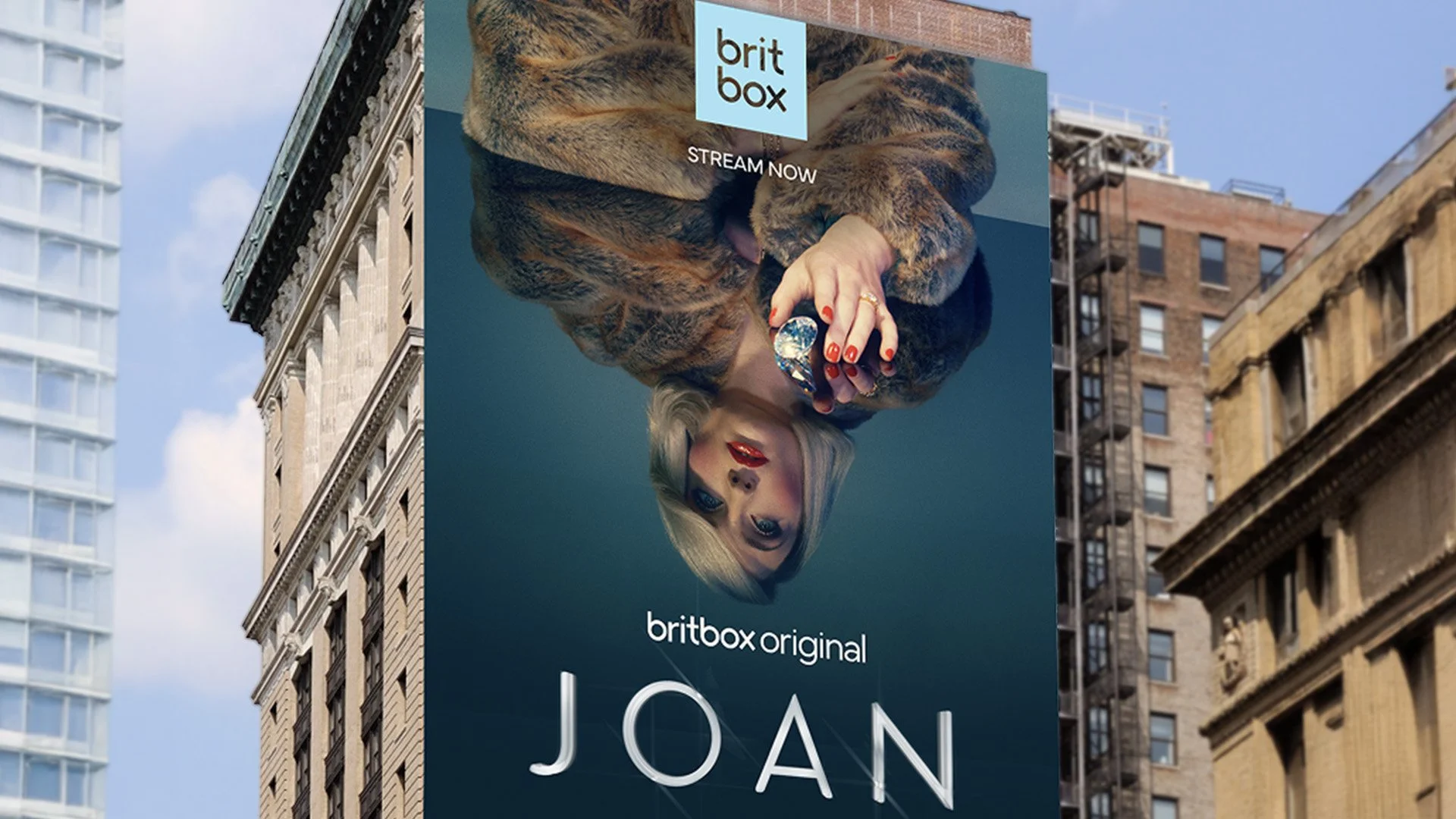
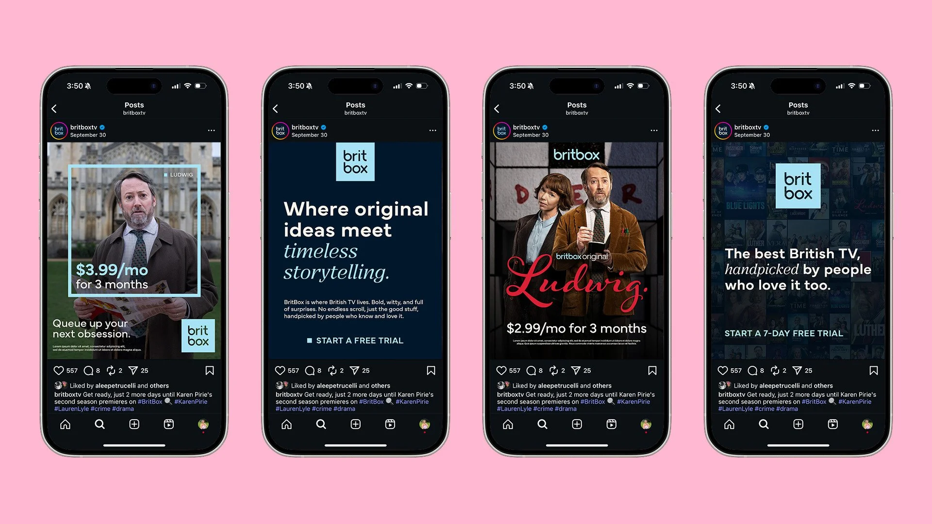
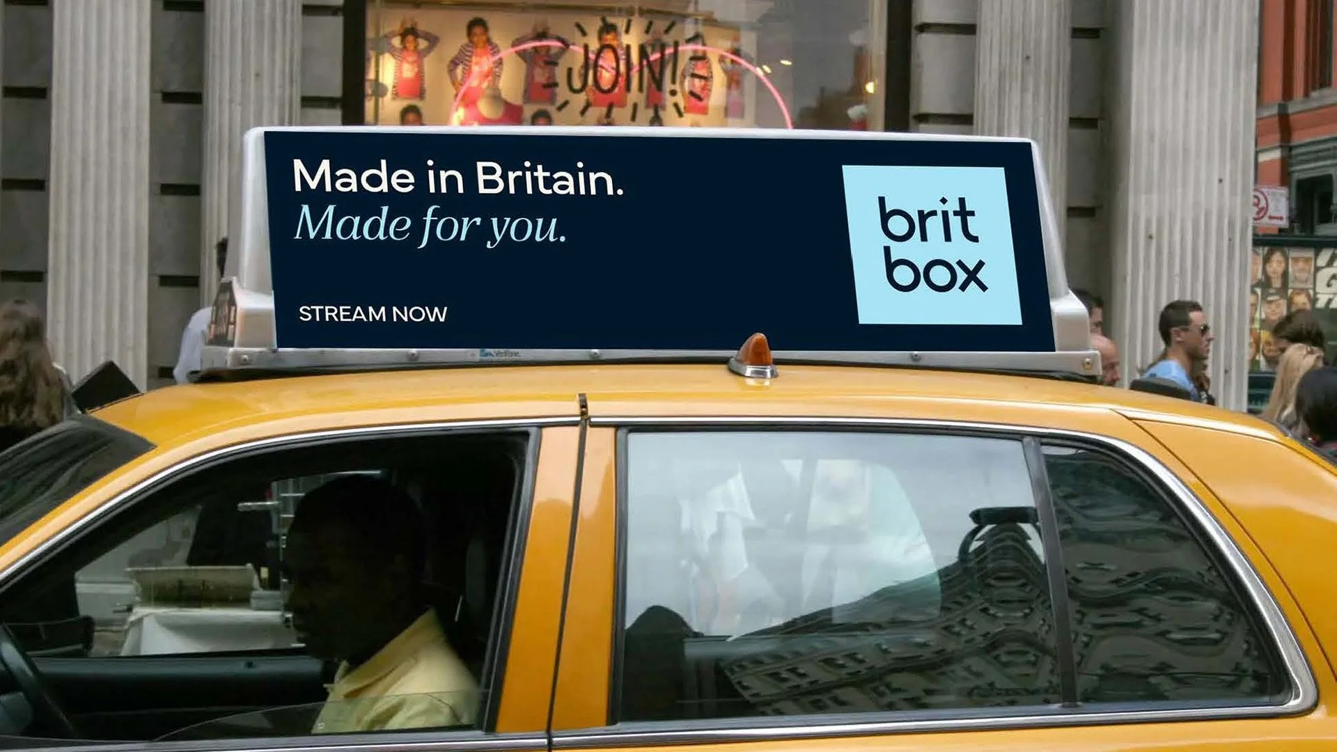
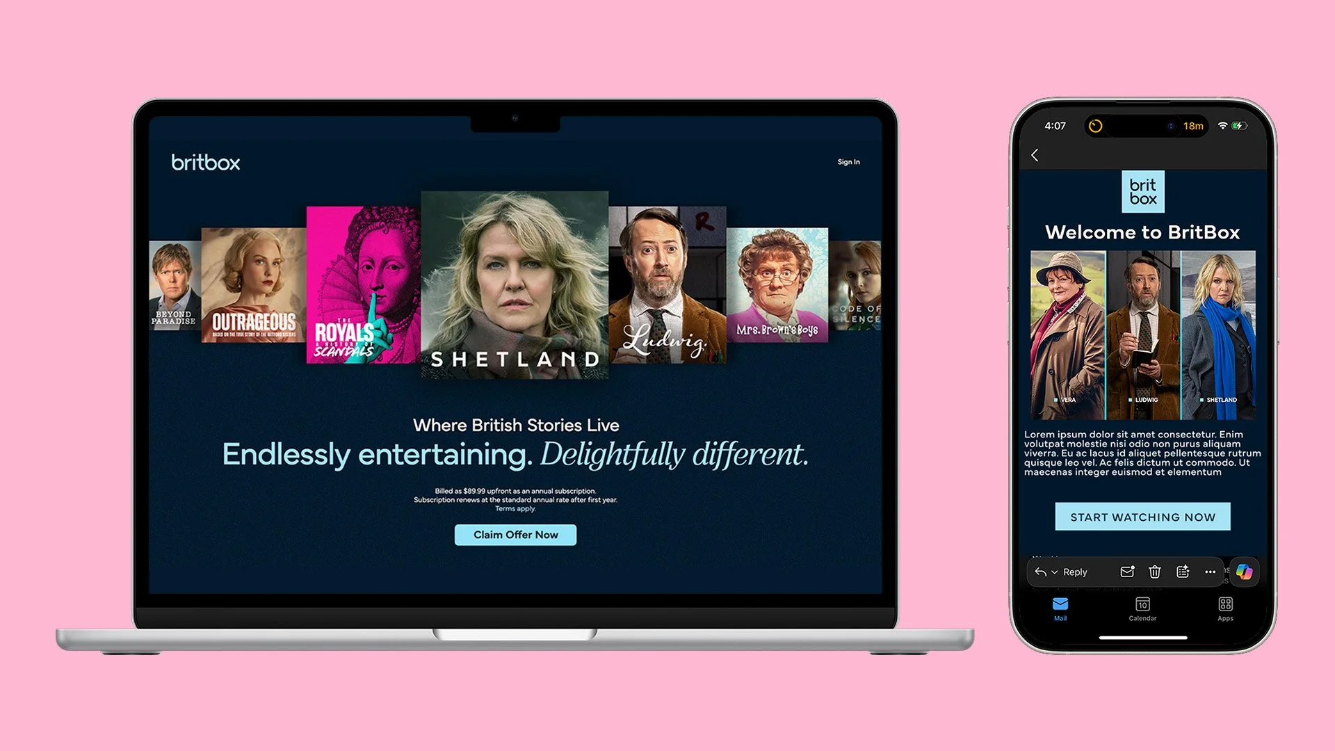
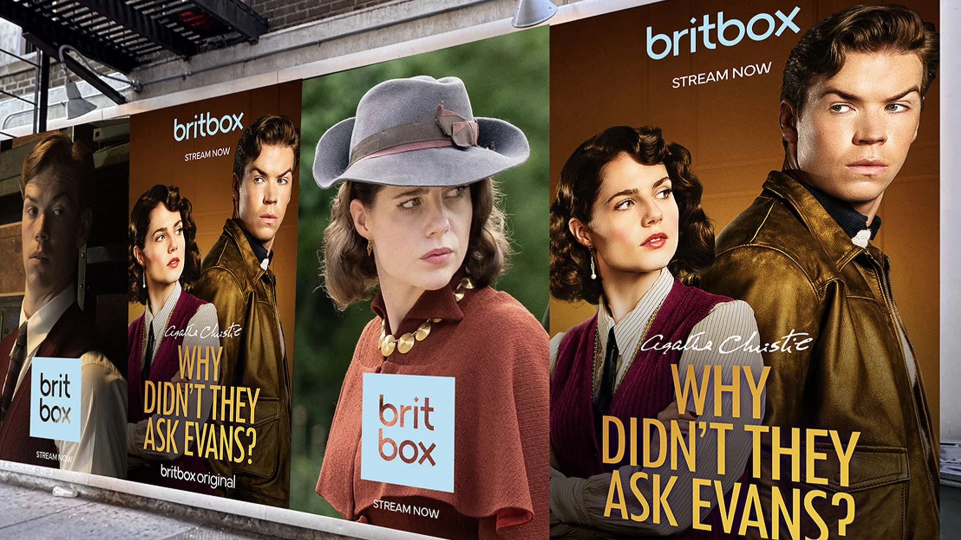
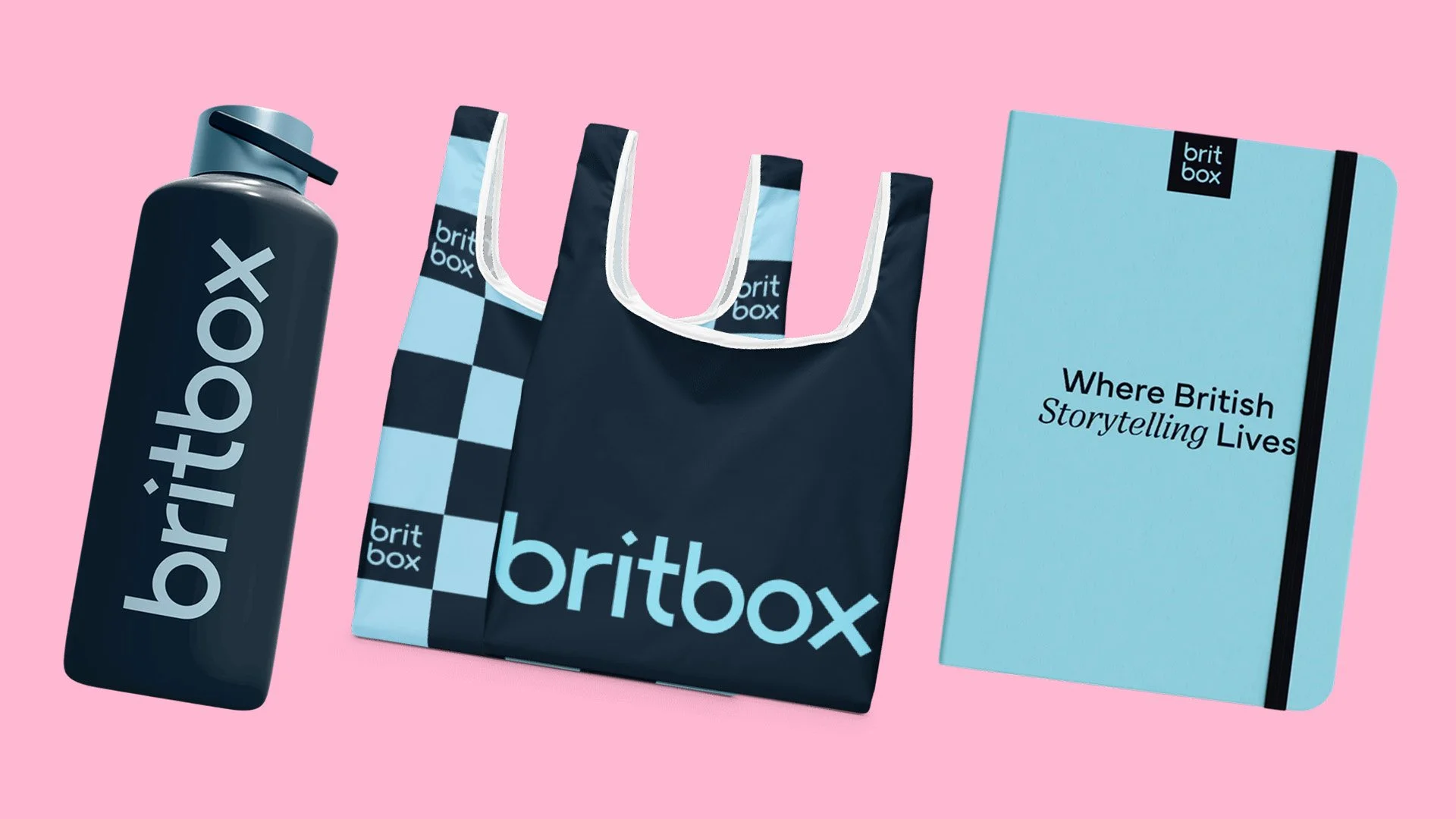
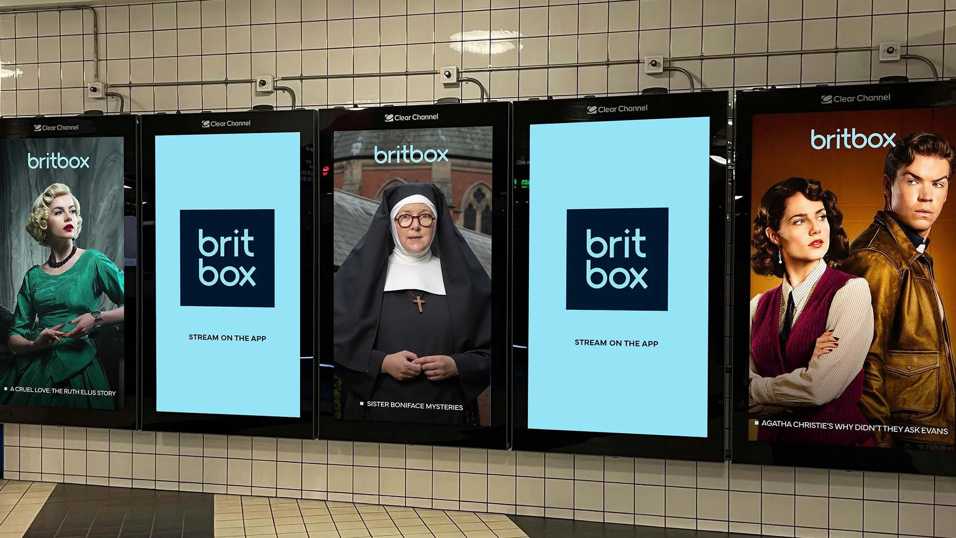
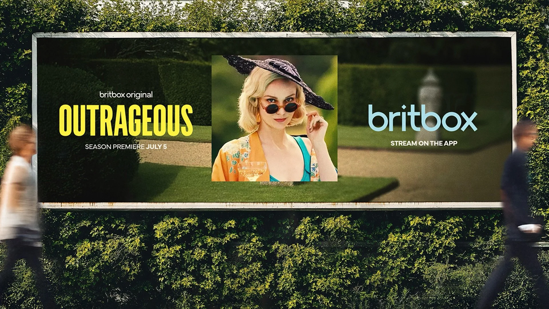
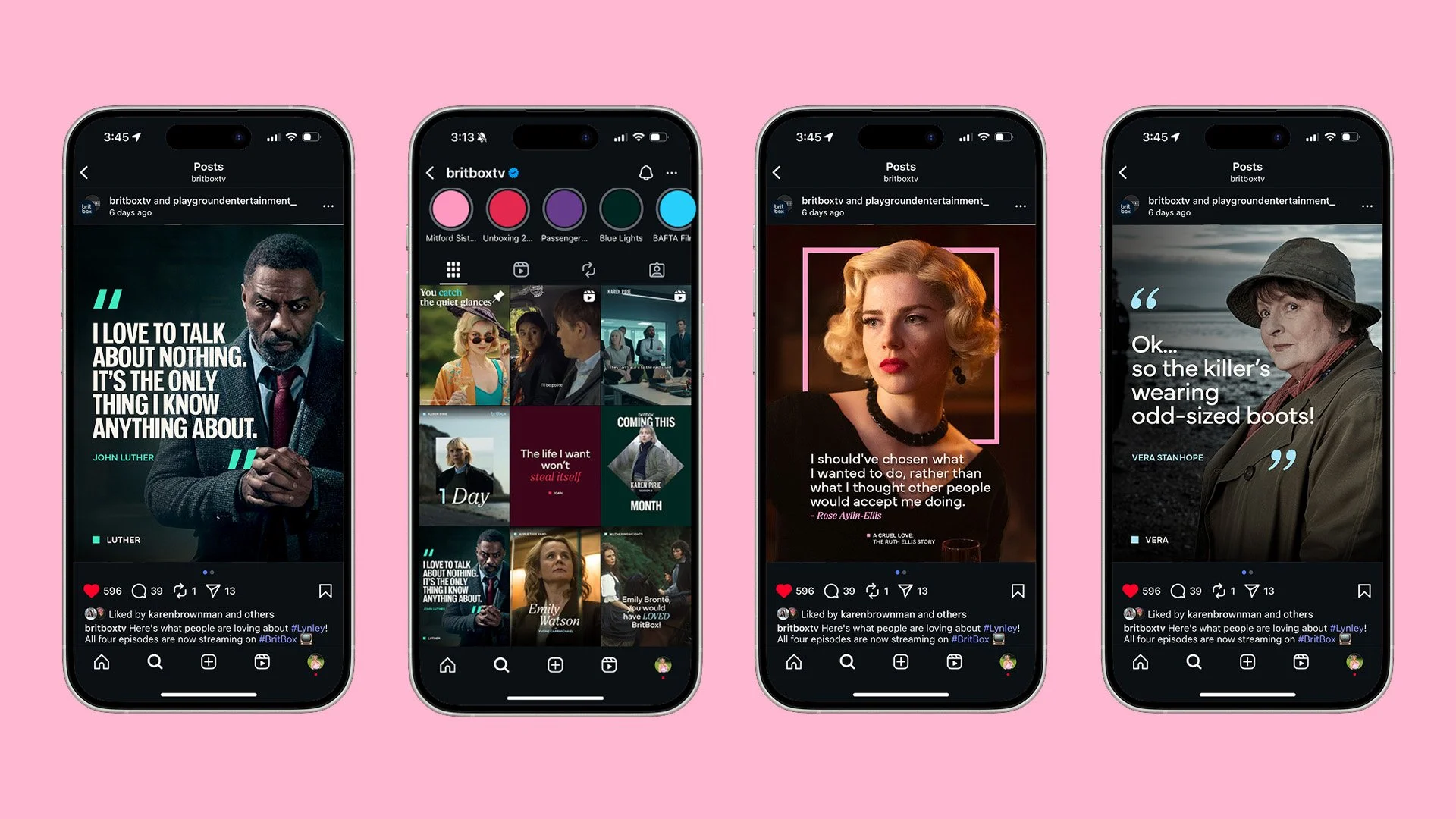
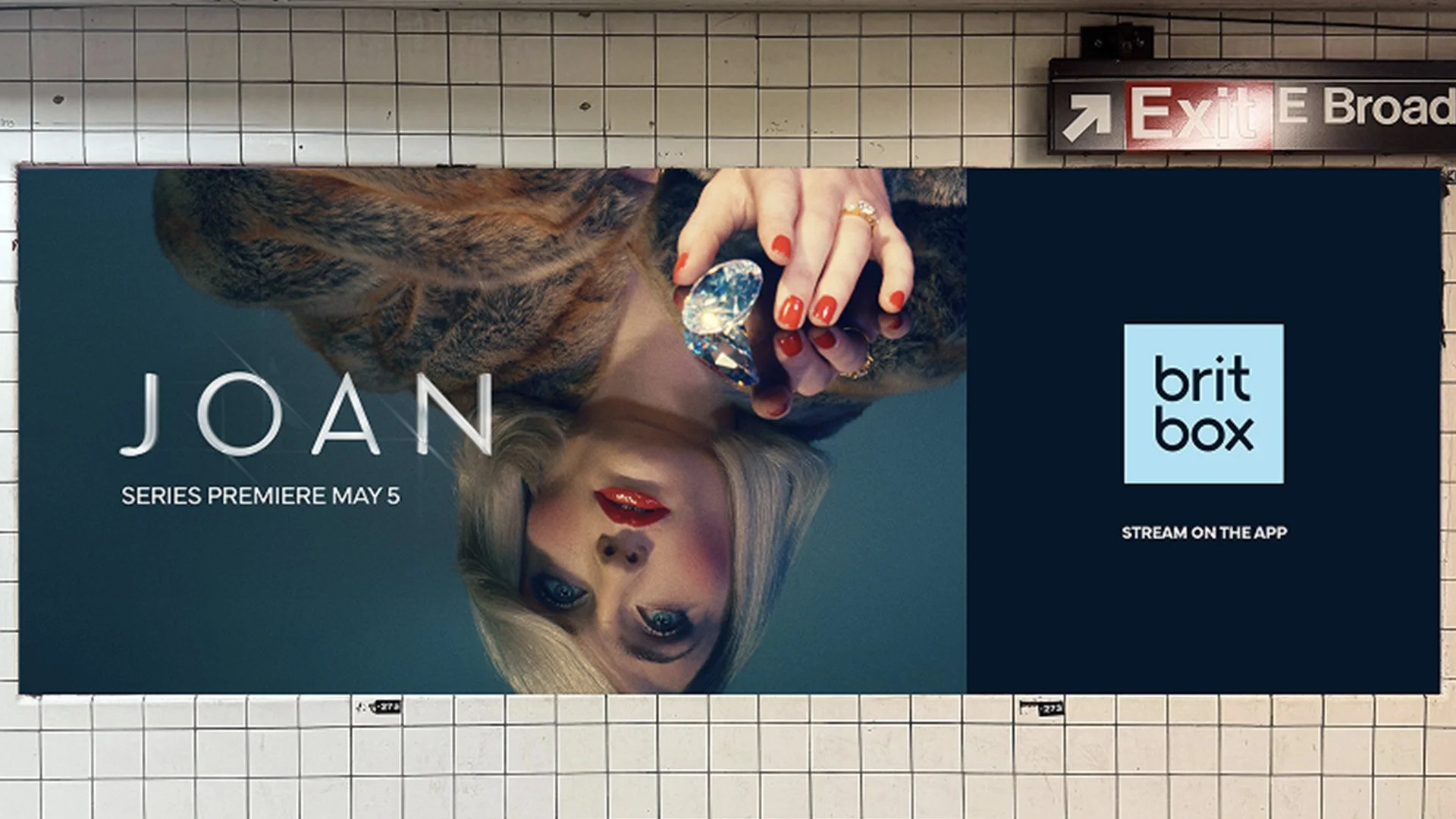
The rebrand leans into the craft and restraint that define British storytelling, choosing subtlety over obvious national cues. Instead of relying on familiar red, white, and blue references, the identity was stripped back to a single-colour mark paired with a more flexible type and color system—making the brand feel modern, confident, and consistent without losing recognition.
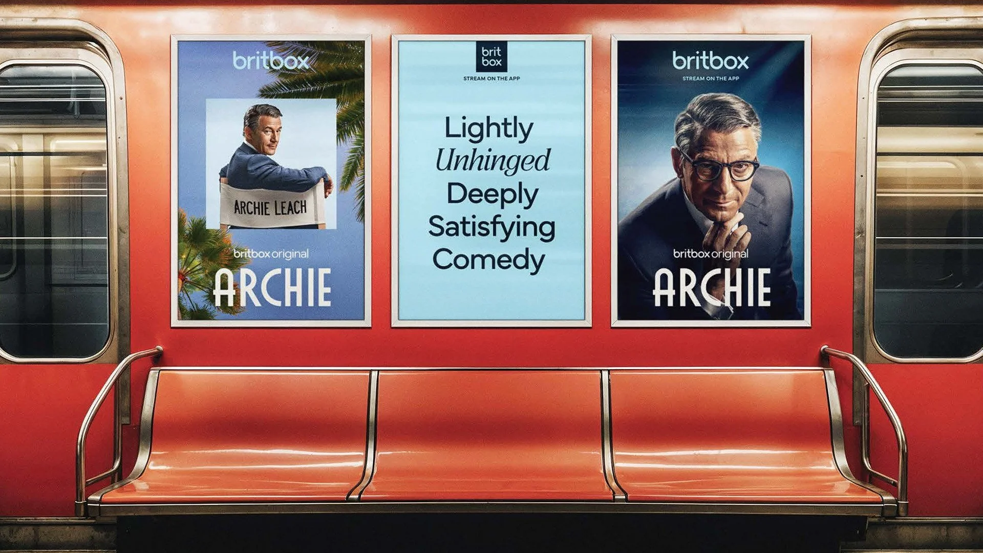
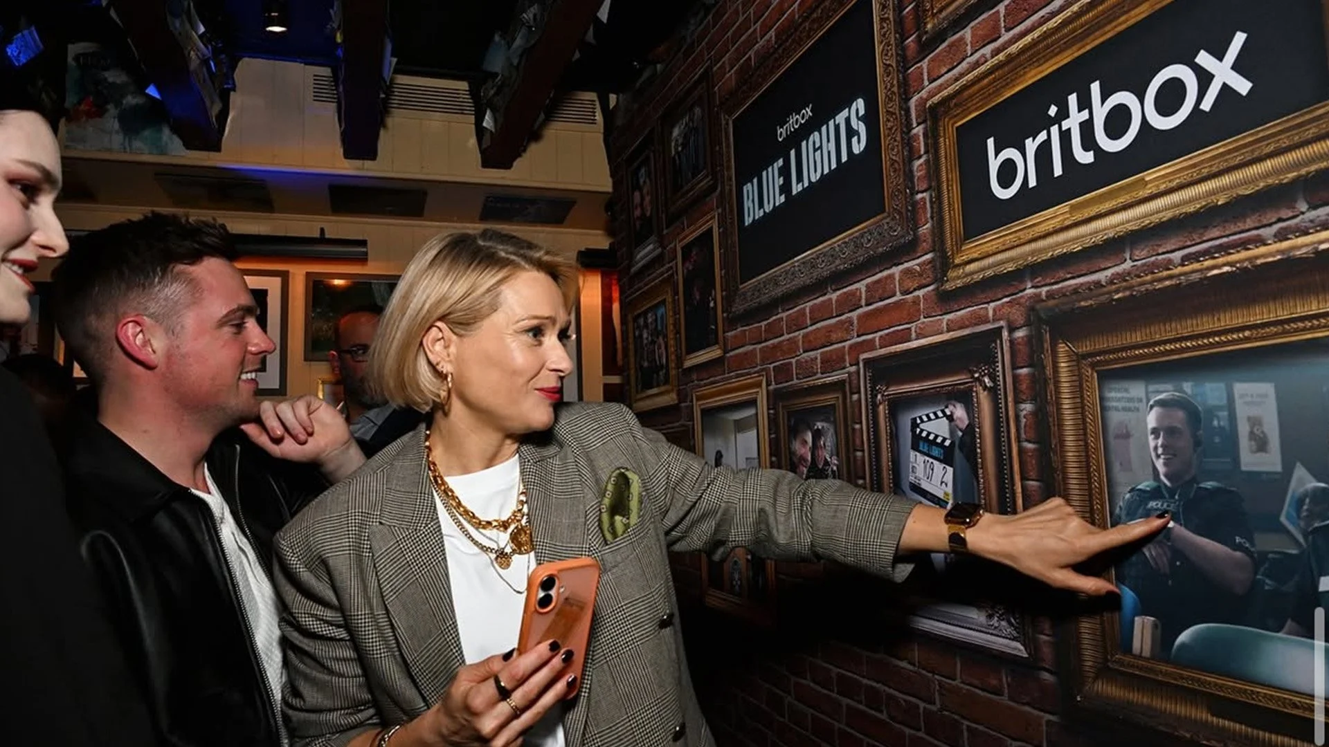
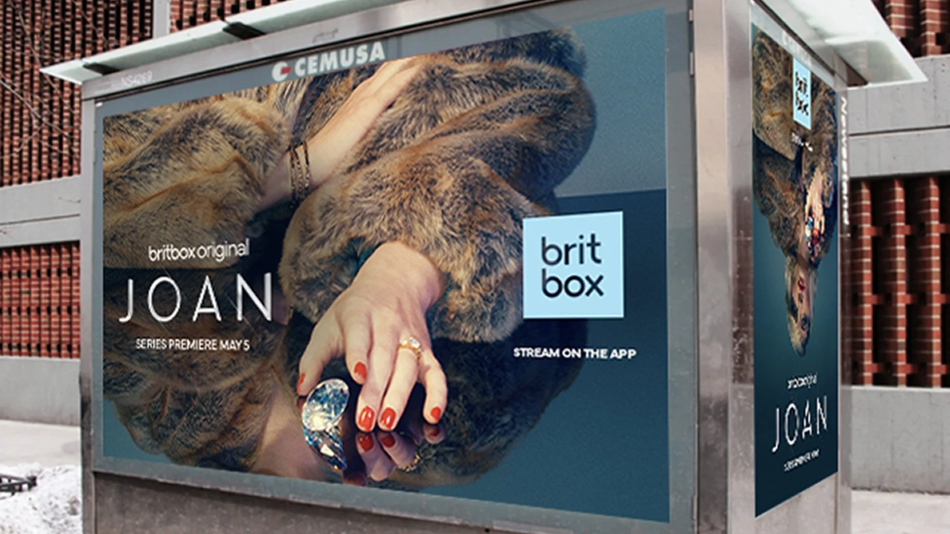
At the heart of it all is the box motif, which moves beyond being just a logo container and becomes a framing device. It shows up across marketing, UI, and promos to spotlight characters and moments, creating a quiet but distinctive BritBox signature—even when the logo isn’t front and center.
BBC Studios – January 2026
New York, NY
Initial Concept – Sibling Rivalry
Project Lead – Beth Newman
Application – Melanie Leonard